

Revealing What Clicks: A Heatmap-Driven Redesign
Case Study
Website Strategy
Services
🧠 Customer Research
💻 Mobile App Strategy
🎨 Mobile App Design
👂🏾Digital Accessibility
Note: This case study is anonymous. Please message me for more information.
Turning real user behavior into a clearer, higher-converting website.
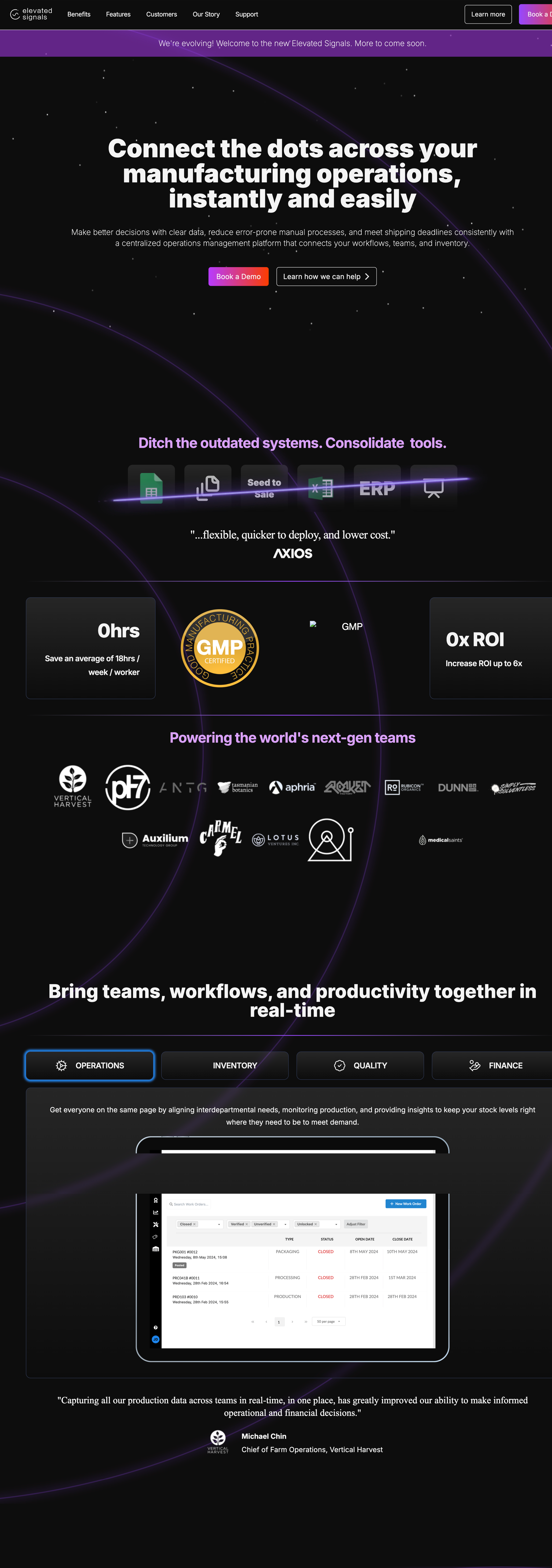
A B2B manufacturing company came with a single-page site that looked good but wasn't converting. Using heatmap and behavioral data, we identified what visitors actually engaged with and used those insights to guide a full, multi-page redesign — turning guesswork into a structure built around how their audience really behaves.
Are you ready to upgrade from one page to a full site? Let’s chat!
Before
Project Goal:
Understand what real visitors were engaging with, then use that to guide a
restructured, multi-page site that made the value proposition clear and
pointed people toward booking a demo.
My Approach
Analyzed heatmaps (Microsoft Clarity) for click behavior, scroll depth, and time-on-section
Reviewed rage clicks and drop-off points to find friction
Ran a competitive analysis and navigation testing to validate a new content structure
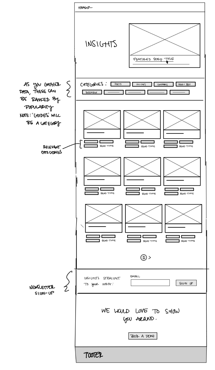
Built 11 wireframes organizing the site around what users actually valued
The Result
The client's team followed the wireframes closely, and the redesigned site
saw a meaningful lift in both new and returning visitors after launch. More
than the numbers, the research gave them a clearer story to build around —
and a site that finally matched how their audience actually thinks.
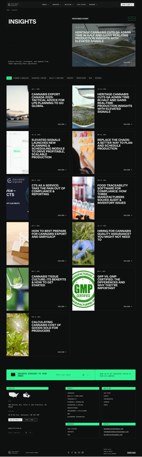
After
“The new site needs to be user-friendly... like more simple, straightforward, easy to understand, and easy to use. And you nailed it.”